Trading Gallery
Market behavior explained through real chart examples.
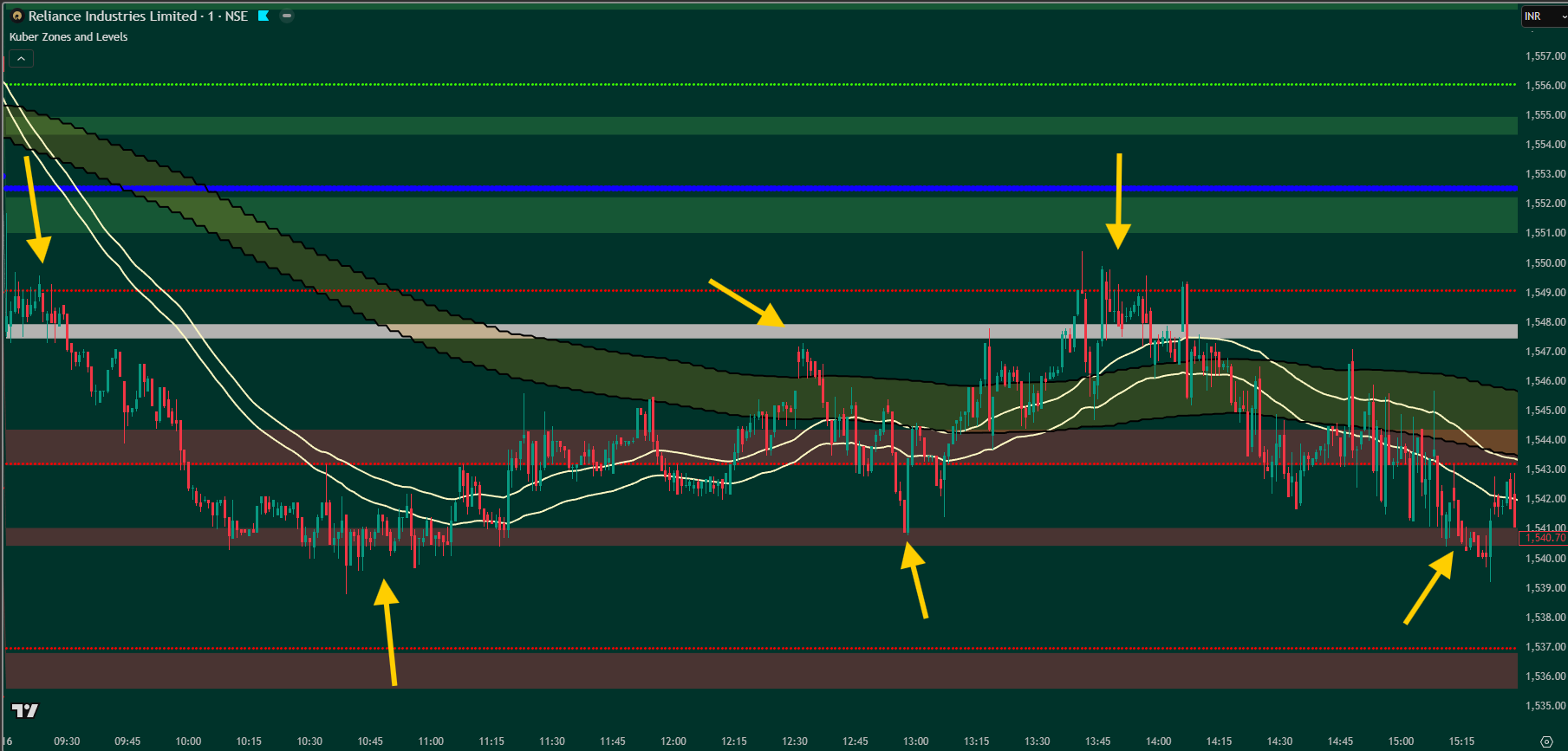
Intraday Trading (1-Minute Chart)
This chart represents intraday trading using the 1-minute timeframe. The market consistently takes support and resistance from Kuber Zones and Levels.
The 1-day market cycle logic helps traders identify important zones and levels early in the session. The band and canal structure further assists in real-time decision-making by highlighting directional bias and reaction areas.
Click on any chart to view in full size.
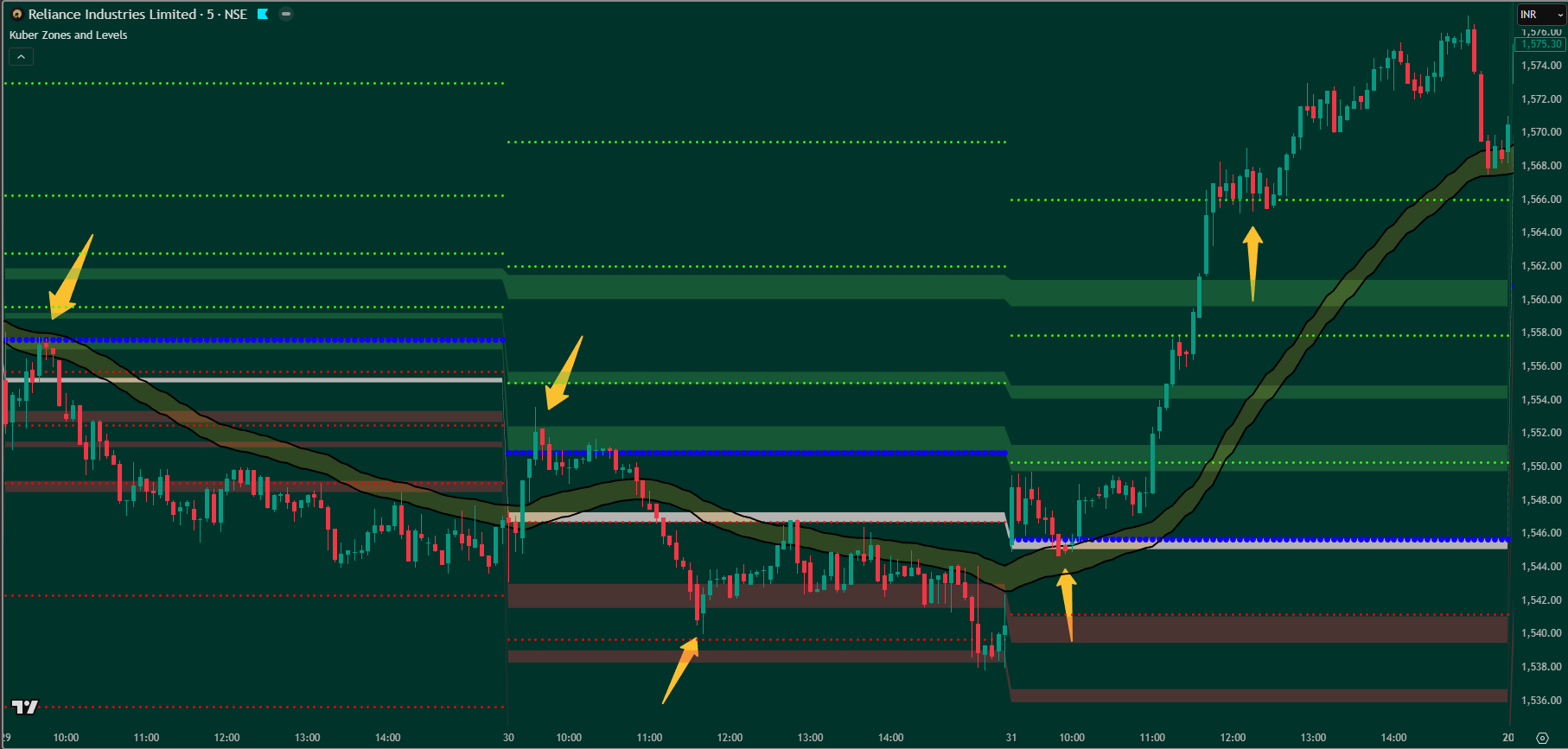
Intraday Trading (5-Minute Chart)
This example is designed for traders who prefer the 5-minute timeframe for intraday trading. Price action clearly respects Kuber Zones and Levels as support and resistance.
The 1-day market cycle logic provides a structured view of important zones, while the band and canal help traders stay aligned with the prevailing intraday trend and avoid random entries.
Click on any chart to view in full size.
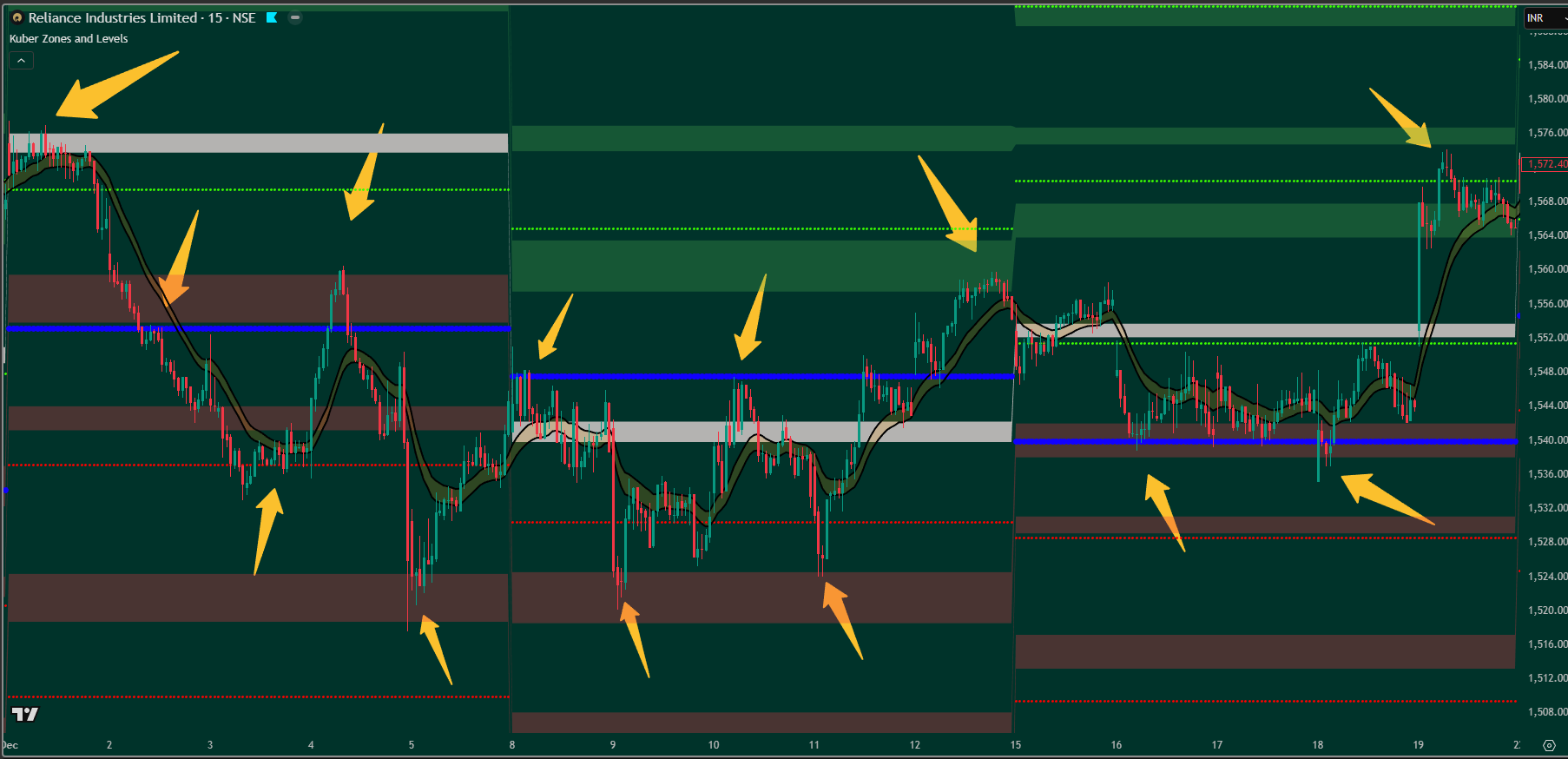
Swing Trading (15-Minute Chart)
This chart demonstrates swing trading using the 15-minute timeframe. Price reacts cleanly around Kuber Zones and Levels, offering clarity for multi-session trades.
The 1-week market cycle logic helps identify broader swing zones, while the canal structure supports disciplined trade planning without over-trading.
Click on any chart to view in full size.
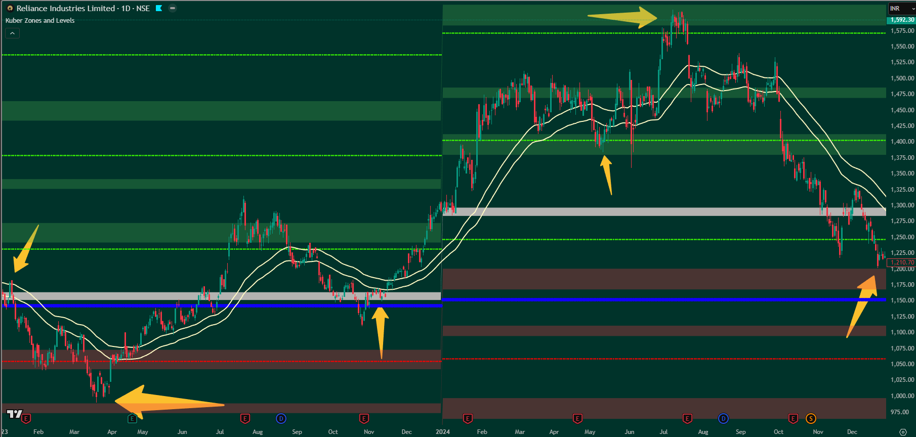
Mid-Term Investment Trading (Daily Chart)
This example focuses on mid-term investment trading using the daily timeframe. The market respects Kuber Zones and Levels over a longer horizon.
The 1-year market cycle logic highlights major accumulation and distribution zones, helping investors understand long-term structure. The canal assists in identifying sustainable trend direction rather than short-term noise.
Click on any chart to view in full size.
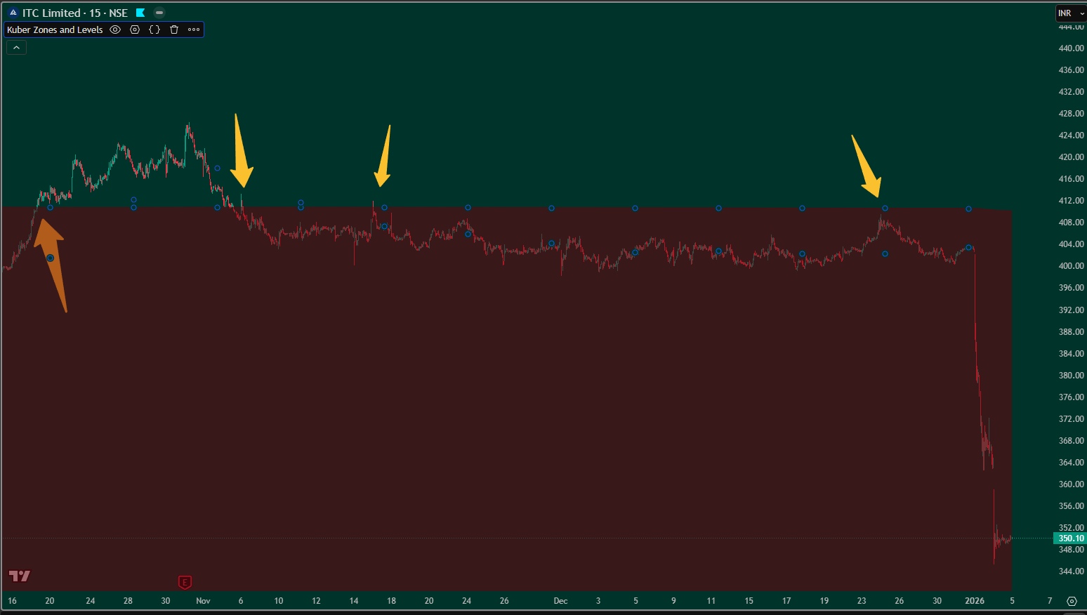
Mid-Term Trading (15-Minute Chart)
This chart shows mid-term trading using the 15-minute timeframe with the Dead Zone enabled.
The Dead Zone helps traders identify clear market direction by filtering low-probability conditions, allowing focus on high-quality opportunities.
Click on any chart to view in full size.
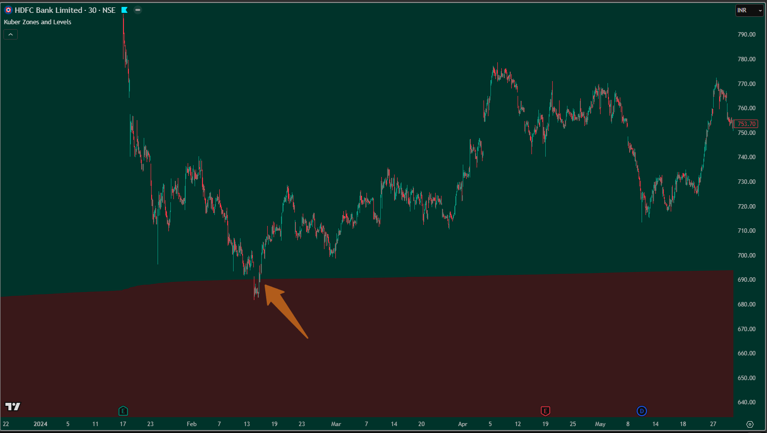
Mid-Term Trading (30-Minute Chart)
This example represents mid-term trading on the 30-minute timeframe using the Dead Zone.
With a higher timeframe, the Dead Zone becomes more selective, helping traders focus on stronger directional setups and avoid unnecessary trades.
Click on any chart to view in full size.
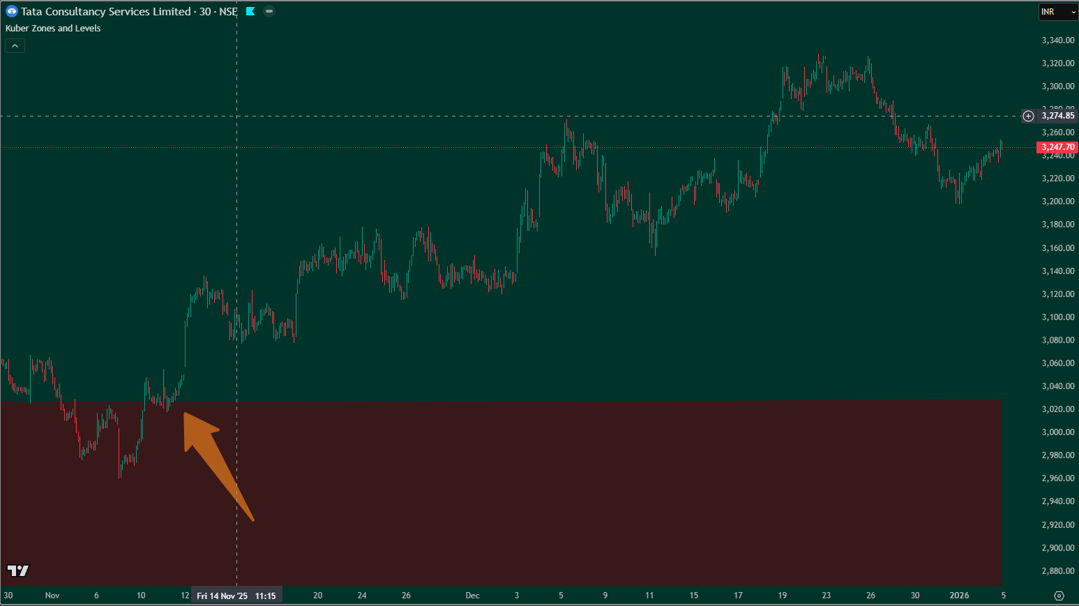
Mid-Term Trading (30-Minute Chart)
Another illustration of 30-minute mid-term trading with the Dead Zone applied.
On higher timeframes, the Dead Zone plays a crucial role in trend confirmation, avoiding sideways or low-momentum phases.
Click on any chart to view in full size.
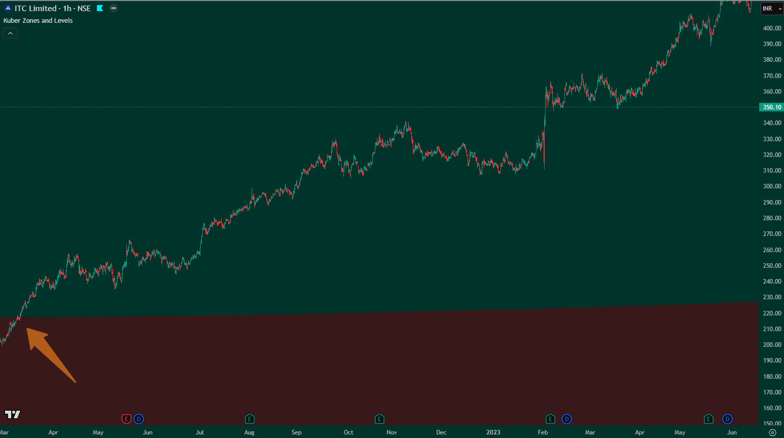
Mid-Term Trading (1-Hour Chart)
This chart demonstrates mid-term trading using the 1-hour timeframe.
The Dead Zone becomes highly effective at this level, clearly defining market direction and allowing focus on high-confidence setups with better risk control.
Click on any chart to view in full size.